In the grammar of ancient Chinese aesthetics, color was never merely decorative; it was a manifestation of cosmic breath. The visual poetry of the world-the blush of fragrant peach blossoms trembling in a spring breeze, the rain-washed azure of a summer sky, the golden rustle of autumn barley, and the inky charcoal of winter mountains-formed a spectrum deeply tied to the elements. These hues were not static; they were markers of time, cycling through the year to evoke specific energies and moods.
This reverence for the natural world’s palette transcended the landscape, finding its way into the material culture of daily life. From the glazes of imperial porcelain to the intricate weaves of turquoise and purple silks, and the red and green tiles of palace architecture, the colors of the seasons became a language of design. Today, that dialogue continues. The symbiosis between nature’s hues and human craftsmanship remains a potent source of inspiration, bridging the gap between centuries-old artifacts and contemporary interiors.
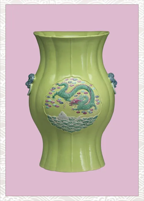
The Awakening: Spring’s Lime and Lavender
The transition from winter to spring is often defined by a tentative, vibrant freshness. It is a time when the earth softens, and the first shoots break the soil. This specific energy is captured with remarkable clarity in the porcelain of the late Qing Dynasty. A prime example is the green-glazed vase with a Dragon Pattern from the Guangxu period, currently housed in the National Taiwan Museum.
Here, the artisan has utilized a lime-green glaze that feels alive-reminiscent of new leaves stretching their soft tips toward the sun. It is not a heavy, forest green, but a translucent, light-filled hue that suggests beginning and growth. Complemented by lavender-tinged pinks, the vessel evokes a mystical, enchanted landscape, where the solidity of the dragon motif is softened by the whimsy of the surrounding clouds.
Green-glazed vase with Dragon Pattern, Qing Dynasty, Guangxu period
This interplay of verdant greens and soft florals translates seamlessly into modern living spaces. The aesthetic logic of the Guangxu vase-balancing the vibrancy of lime with the soothing touch of pale purple-enlivens a room without overwhelming it. It brings the “sweetness” of springtime indoors, creating environments that feel simultaneously restful and rejuvenating.
The Modern Echo: Bringing the Garden Indoors
The legacy of these nature-based palettes is evident in the work of contemporary designers who treat interior spaces as canvases for organic expression. Whether through hand-painted wallpapers or curated textiles, the goal remains the same: to dissolve the boundary between the built environment and the natural world.
Designers like Marie-Caroline Willms and Katie Ridder utilize these historical color pairings to create depth. By anchoring a room with the fresh greens seen in the Qing artifacts and layering them with botanical motifs, they achieve a sense of timeless elegance. The intricate de Gournay wallpapers, often painted on Xuan paper, mirror the detailed brushwork of ancient ceramics, turning walls into immersive gardens.
Interior & Architecture examples by Marie-Caroline Willms and de Gournay wallpaper by Anna Spiro
In these spaces, color functions as atmosphere. A room layered with these hues does not just look like a garden; it feels like one. The sunlight interacting with these fabrics and paints mimics the play of light on leaves and petals, proving that the ancient observation of the seasons is as relevant in a modern penthouse as it was in an imperial court.
Interiors by Susan Deliss and Katie Ridder
The Radiance: Summer’s Gold and Azure
As the seasons shift, the palette intensifies. Summer brings with it the heat of the sun and the cooling contrast of the sea. This dynamic duality is masterfully preserved in the ceramics of the Qianlong period, a high point in the technical history of Chinese porcelain.
The yellow-glazed vase with fencai (famille rose) enamels serves as a visual anchor for this season. The background is a striking, imperial yellow-symbolizing the earth and the sun-while the motifs are rendered in electric blues. This combination is not subtle; it is energetic and rhythmic, mimicking the sensation of golden sands and waves rolling ashore.
Yellow-glazed vase decorated in fencai enamels, Qing Dynasty, Qianlong period
The fencai technique allows for a gradation of color that adds three-dimensionality to the surface, making the blue motifs appear to float against the yellow ground. In an interior design context, this high-contrast pairing of sunshine yellow and beachy blues creates a harmonious yet stimulating environment, capturing the vibrant, life-affirming spirit of high summer.
 Green-glazed vase with Dragon Pattern, Qing Dynasty, Guangxu period
 Interior & Architecture examples by Marie-Caroline Willms and de Gournay wallpaper by Anna Spiro
 Interiors by Susan Deliss and Katie Ridder
 Yellow-glazed vase decorated in fencai enamels, Qing Dynasty, Qianlong period


